
In a world where athletes carry GPS watches, wearables track every heartbeat, and AI platforms analyze training data, it may seem old-fashioned to rely on static pace charts. Yet the truth is simple: clear, well-structured pace charts remain one of the most useful tools for triathletes and coaches. They provide instant clarity, remove unnecessary complexity, and anchor both training and racing in a framework that is easy to understand and apply.
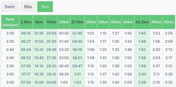
Table of Contents
Simplicity That Cuts Through the Noise
Modern technology offers endless data streams — heart rate variability, power curves, sleep scores, recovery metrics. While these are valuable, they can easily overwhelm athletes, especially in the final stages of race preparation. A pace chart, on the other hand, reduces the sport to its essentials: how fast you need to swim, cycle, and run to achieve a target finishing time.
For a coach, pace charts serve as a communication tool. They allow athletes to visualize the relationship between goal times and realistic splits without needing to interpret graphs or run simulations. For the self-coached triathlete, they provide a quick reference point in training, helping ensure that intervals, brick sessions, and long runs are aligned with race-day objectives.
Covering All Race Distances
Our pace charts are not limited to full IRONMAN® races. They also include Full IRONMAN® and 70.3 distances as well as Olympic, and Sprint triathlons, giving athletes and coaches a quick reference across the most common race formats. Whether you’re preparing for your first half-distance or fine-tuning your strategy for a long-distance event, the charts provide consistent guidance on realistic swim, bike, and run splits. This versatility makes them a valuable tool throughout the entire triathlon journey.
Where the Race Is Won – and Lost
Our research based article What Really Predicts IRONMAN® Performance in Age-Group Athletes? highlights an important reality: while triathlon will always be about mastering three sports, cycling and running are far more predictive of overall race success than swimming. Swimming remains critical, but it typically accounts for a smaller proportion of total race time, offering fewer opportunities for dramatic improvement.
For athletes and coaches, pace charts reinforce this insight. By showing the relative weight of each discipline in the overall result, they make it clear where training energy should be invested. Long rides and well-paced runs carry the biggest payoff, and pace charts make that distribution of effort tangible.
Training Smarter, Not Just Harder
A second layer of evidence comes from our article Strength Training and Endurance Performance – What the Latest Umbrella Review Reveals. For years, endurance athletes worried that lifting weights would compromise aerobic development. The latest data show the opposite: strength training enhances running economy, improves time trial outcomes, and supports efficiency across long distances.
Charts play a complementary role here. They can be used to track improvements in pacing that arise from better economy and efficiency. When an athlete sees faster times at the same perceived effort, pace charts provide a clear before-and-after comparison. This transforms abstract physiological gains into visible progress markers, which in turn supports motivation and training adherence.
Injury Prevention and Consistency
Finally, our post Beyond Training: How AI and Synthetic Data Could Prevent Injuries in Triathlon looks ahead to a future where wearable data and machine learning predict injury risks before they happen. While this technology is promising, the fundamental principle remains unchanged: consistency is the foundation of endurance performance. Athletes who stay healthy can train more steadily, absorb more load, and perform better on race day.
Here, pace charts again prove their worth. By anchoring training intensity to realistic targets, they prevent athletes from falling into the trap of overpacing sessions or racing beyond sustainable limits. They act as a simple guardrail, reducing the risk of chronic overload — a cause of many overuse injuries.
A Bridge Between Science and Practice
The enduring power of pace charts lies in their ability to bridge scientific evidence and practical application. They translate complex findings — about discipline priorities, training adaptations, and injury prevention — into a format that every athlete can use. For beginners, they provide confidence and structure. For advanced age-groupers chasing a Kona slot, they provide precision and accountability. And for coaches, they remain one of the most effective tools to align expectations, communicate strategies, and measure progress.
Conclusion
Technology will continue to evolve, offering new insights into physiology, biomechanics, and performance prediction. But when it comes to day-to-day decision-making in training and racing, triathlon pace charts remain timeless. They are quick to read, easy to apply, and deeply grounded in the realities of the sport.
By combining this simple tool with the latest scientific knowledge — from prioritising cycling and running, to integrating strength training, to leveraging injury prediction models — athletes gain the best of both worlds: clarity from the charts, and confidence from the science.